Pin-Wei Garden Tea
PACKAGING/BRANDING 2022-ONGOING PROJECT
I worked with PWG Tea, a family-owned business founded 25 years ago in Taiwan, known for their award-winning teas. I handled the branding, from the logo and color scheme to the overall look and feel of their visual identity. This included designing the packaging for their NO.18 Taiwan Tea and Taiwan High Mountain Oolong Tea, as well as creating print and digital materials like space signage, ads, and social media content to help shape their brand’s presence across different platforms.


The Process - Mood
PWG wanted something deeply connected to heart, culture, and an appreciation for traditional vintage Asian art—incorporating delicate lines, landscapes, and an elegant, muted gradient feel. They were especially drawn to the organic, imperfect beauty of traditional stamp designs, where ink seeps beyond the edges, creating a sense of authenticity and craftsmanship.
With that in mind, I designed a logo that echoes the essence of a hand-stamped seal while also capturing the flowing lines of a tea farm. Instead of the expected, traditional greens, PWG preferred a more refined palette. I chose black and an amber-brown hue as the primary colors—representing the way tea transforms as it brews, deepening in richness. Each shade was carefully selected and named to reflect tea culture: the black, Night Brew, and the warm brownish coral, Tea Spiced. Accents of green, gold, and a soft gradient bring in the ever-changing beauty of Nantou—the heart of their tea farm—where misty mountains and glowing sunsets create a landscape as layered and dynamic as the tea itself.
Celebrating 25 years in business, PWG is deeply rooted in tradition. However, they wanted a new look and vibe that would resonate with today’s audience, bridging their rich history with a fresh, modern appeal. Earlier this month, I had the chance to visit their farm in Nantou, experiencing firsthand the landscape, the tea-making process, and the deep-rooted traditions that inspire PWG. Seeing it all in person made this project even more meaningful, allowing me to capture the essence of their world through design.
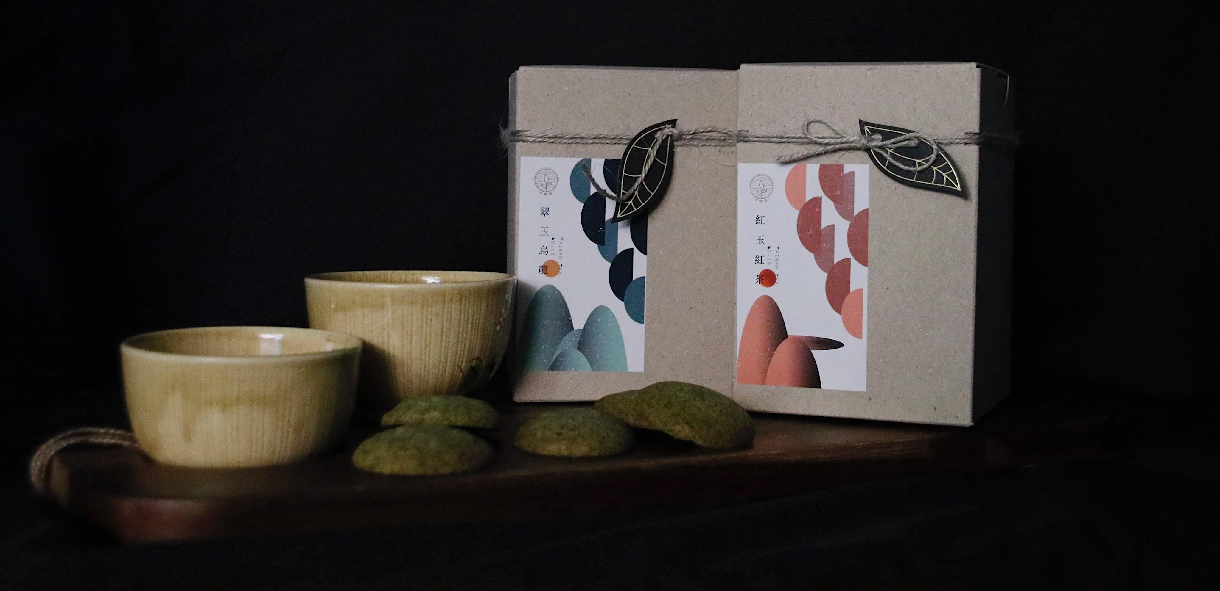
The Process - Packaging
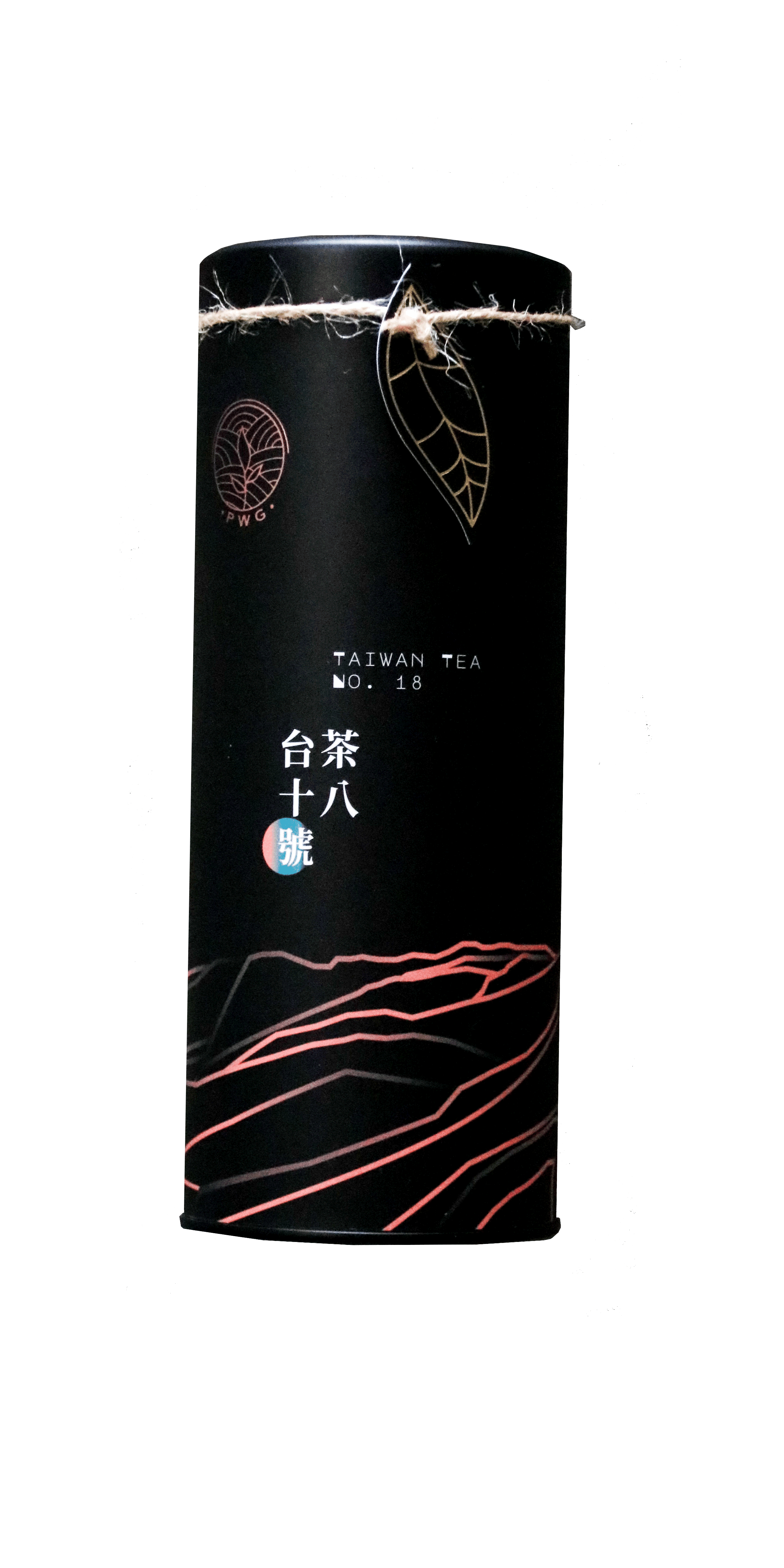
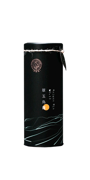
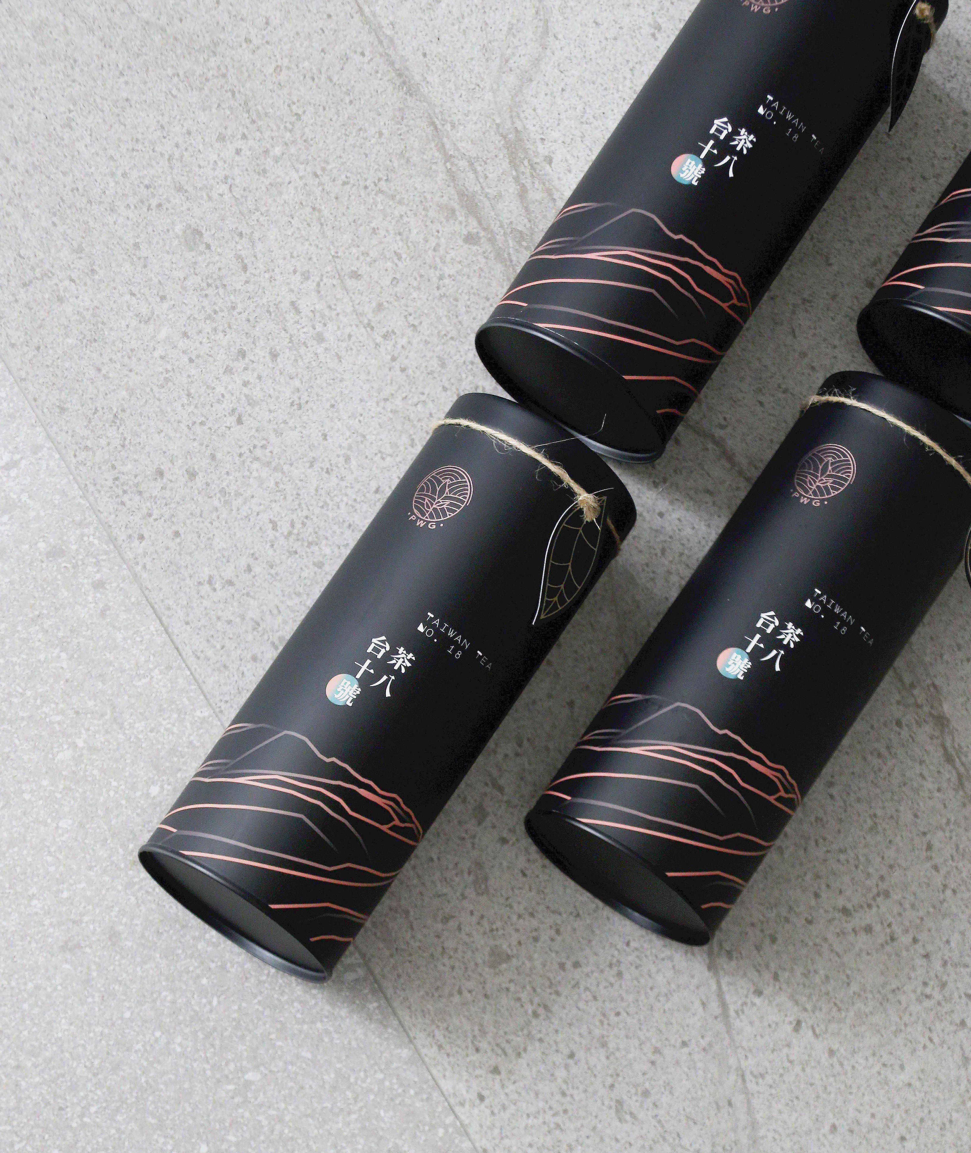
The delicate lines and gradient were thoughtfully incorporated into their packaging, complementing the elegance of their two signature teas: No. 18,
an award-winning black tea, and No. 13, a beautifully crafted green tea. To highlight the distinct personalities of these teas, I used two different fonts—
one reflecting the depth and richness of the black tea, and the other capturing the freshness and vibrancy of the green tea.

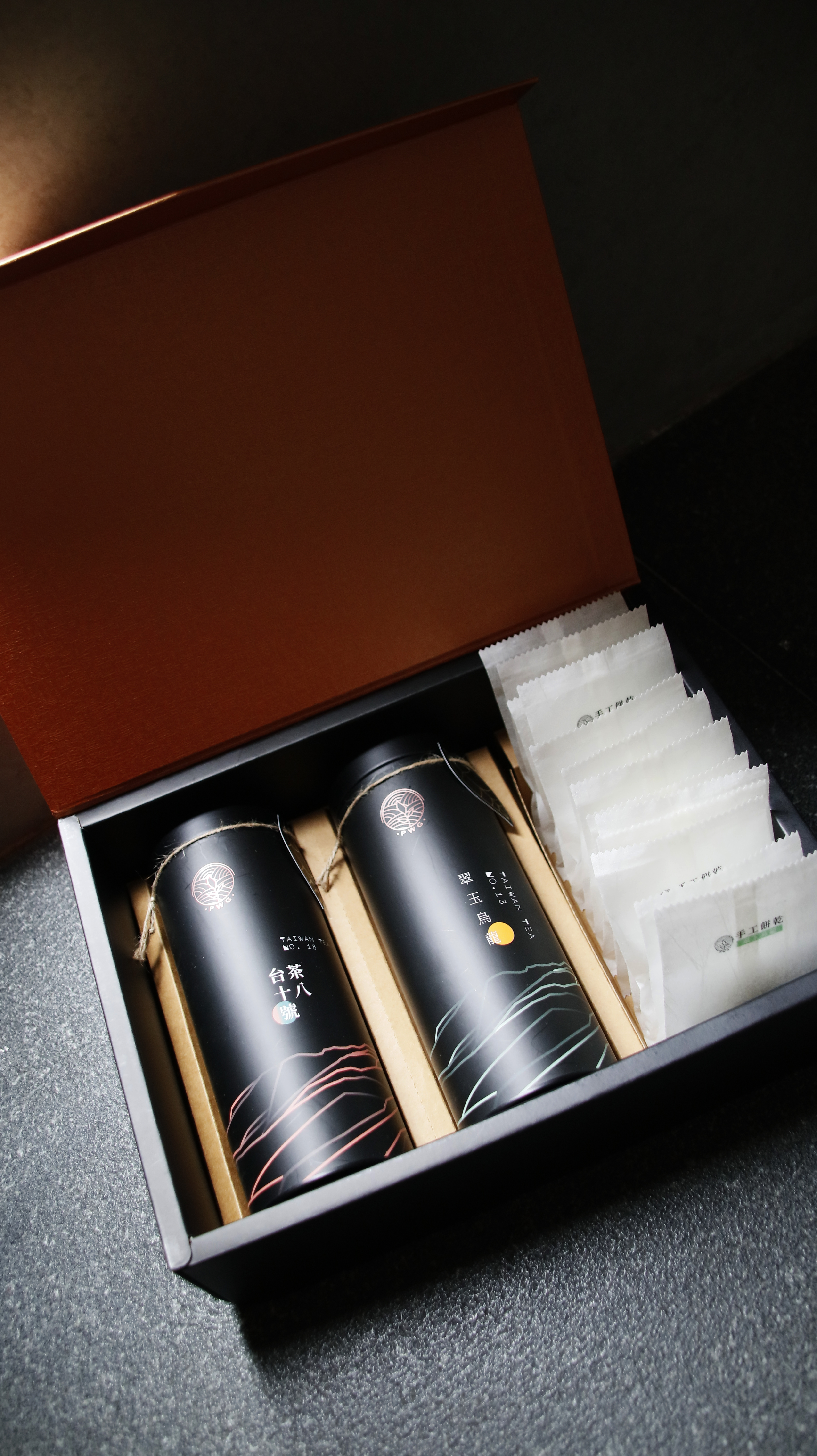

(Sneak preview below - the new 2025 tea set and cookies- coming soon)
©Jessica Chen,2025