Brand Identity / UX, UI / Print design / 2019-2020
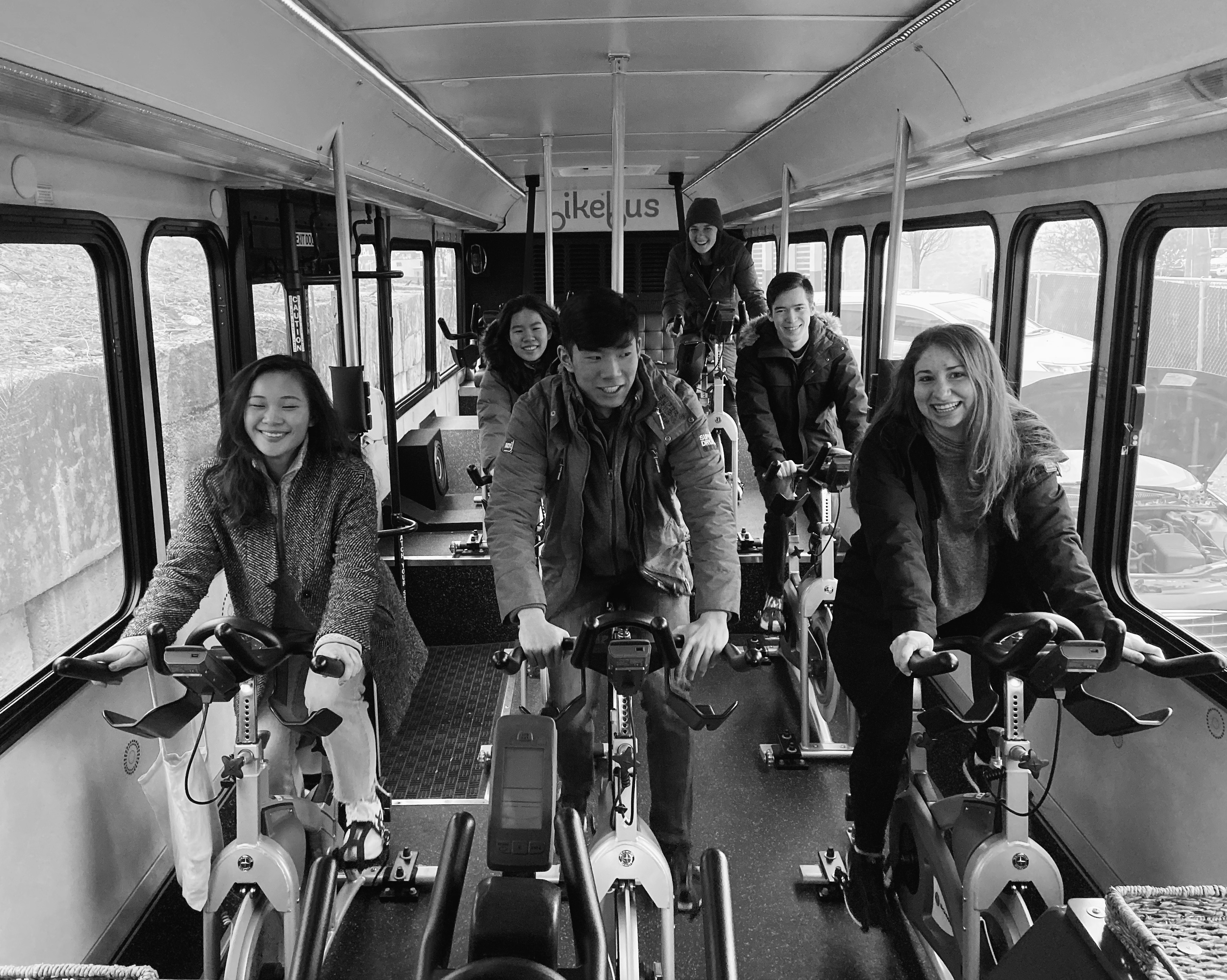
Bikebus,the world’s first mobile cycling studio provides high-energy fitness experience that offers group cycling sessions
as you traval around the city for all experience levels in the Boston area.
The company wants their brand to have fresher look
by having a new logo, website and brand visual assets.
Collaborated with Melvin Chen, Megan McGuire, Joe Wang, Jean Zhang, Mckenna poulos at scout.

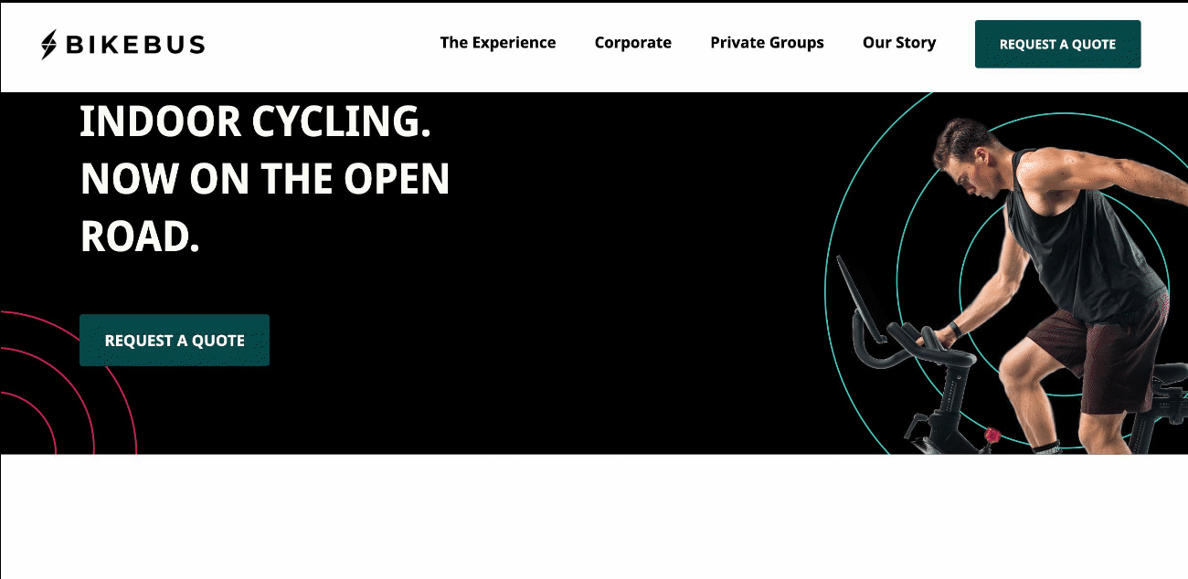


The only typeface used in both web and prin is Noto Sans, Noto Sans Condensed Bold and Noto Sans Medium are used for headings, while Noto Sans Regular is primarily used for body text.
This typeface gives Bikebus a clean brand appearance.

Circles are important accessories to Bikebus brand. They are dynamic, suggesting a sense of movement, flexibility and energy.
 ︎
︎